
Cyrille Zimmer is a reference in his field. He is one of the few people in the region to offer such comprehensive and specialized change management services. All those who know him and/or have worked with his team agree that he is excellent.
CZ Conseil, which stands for Cyrille Zimmer Conseil, has been gaining momentum in recent years. The consulting firm already had a logo, but called on the Storyline team to take the branding a step further.
One of the objectives was to convey the image of the Lanaudière region, where the client is based, while remaining modern and differentiating itself from competitors. The human approach was also at the heart of the approach, and had to be reflected in the brand.
The choice of color was initially made in reference to nature, to echo the region. Green is also a sign of progress, as when a project is given the green light. The use of a neon hue is more youthful, lively and daring.
We’ve combined it with cobalt blue as a complementary color, a color more associated with rigor and the analytical side. The colors can be used on their own or as a gradient.
Fonts have been standardized for greater harmony. Color has also been added to the slash. There is now only one way to use their logo.


Our branding specialist, Alexie Leblanc, wondered about their initial slogan: “Those who love what they do, do it better”. While she really liked the phrase, she felt it didn’t help us understand the brand’s business. The slogan was more about the promise or result of their services. Alexie suggested keeping it at the end of a presentation or at the bottom of a web page.
The customer sometimes used the phrase “Change made easy” in its communications. This short, punchy phrase is now the company’s slogan. In three words, you can understand the type of services offered. It’s short and to the point.
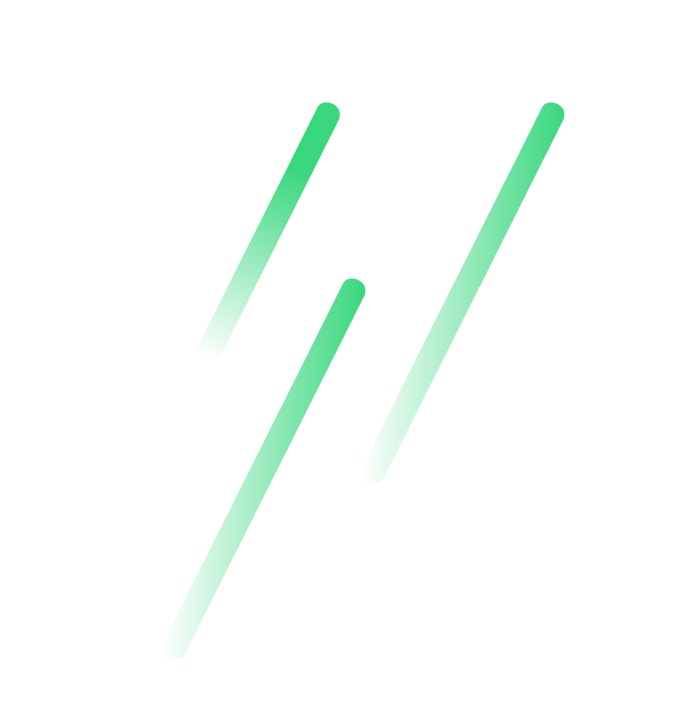
The use of the diagonal bar is now one of the main graphic elements. We like this simple line, which clearly conveys the idea of ascending. This concept of ascending has been accentuated with the use of gradient.
The 26-degree slash has also been applied to the truncated corners of the various graphic elements for greater harmony and continuity.
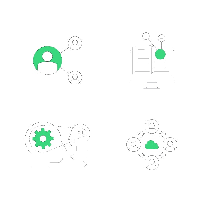
The standard guide also suggests icon styles to be favored, as well as the adoption of a photographic style where dark backgrounds are contrasted with clean, yet warm compositions. Close-up portraits in a relaxed style reflect CZ Conseil’s authentic, human approach, which sets them apart from the highly corporate image of their competition.


Concept and design: Alexandra Hamel and Alexie Leblanc
Graphics: Alexie Leblanc
Our experience with them was in every way what Cyrille described to us: a human and caring approach, yet perfectly structured and rigorous. The future looks bright for CZ Conseil.